
Someone looking for a therapist, a home care agency or a pharmacy is rarely browsing for fun. They are worried about themselves, a child or a parent. They are often short on time, on a phone, and comparing several providers at once. A website has seconds to earn their trust.
We have built websites for a therapy practice in Wisconsin (TC Counseling Services), a home care agency in Maryland (LIMS Home Care) and a digital pharmacy in Ghana (PharmAssyst). Different services, different countries, but the people using them ask the same kinds of questions. Here are seven lessons from those three sites.
1. Answer the deciding questions before the phone call
For a therapy practice, one of the questions that decides whether someone calls is simple: do you take my insurance? If the answer is hidden behind a phone call, many people simply move on to the next practice.
On the TC Counseling site, accepted insurance plans and superbill options are on the page rather than behind a phone call, hours and directions are on the contact page, and a What to Expect page covers the first session. Each answer removes a reason not to get in touch.
Make a list of the three questions your front desk hears most often, and answer them on the site where people will see them.
2. Explain every service in plain language
Clinical terms mean something to professionals and very little to a worried parent. Each service should say who it is for and how it helps, in the words your clients would use.
TC Counseling explains five services, from children and teens to couples, without jargon. LIMS Home Care describes nine services, from personal care and meal preparation to respite, surgical recovery and companionship and memory care, each with its own "ask about this service" link.
3. Make the first step small
"Book an appointment" can feel like a big commitment for someone who is not sure yet. A smaller first step gets more people through the door.
TC Counseling leads with a free 15-minute consultation, one tap from any page. LIMS Home Care lays out a four-step "how care starts" path that ends in a free consultation, so families can see exactly what happens after they call. A What to Expect page does the same job for therapy: it walks new clients from first contact through intake and ongoing sessions, so nothing feels unknown.
4. Show your safeguards, don't just claim them
"Trusted", "caring" and "professional" are on every provider's website. What people believe is evidence.
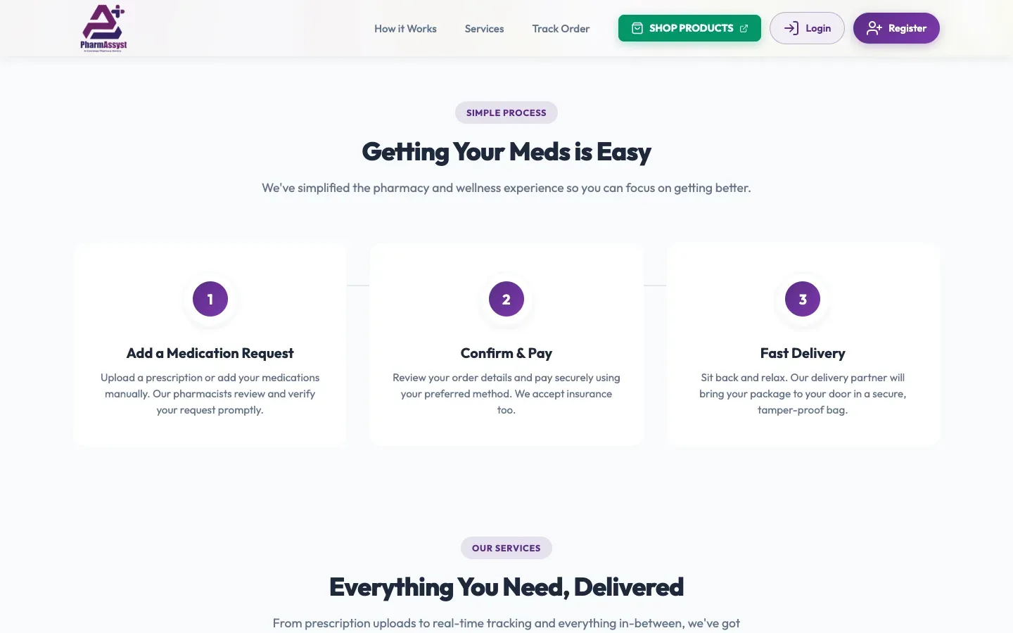
For LIMS Home Care that means a section on licensing and background checks, and testimonials from a nurse care manager and a social worker. For PharmAssyst it is built into how the service works: every medication request is reviewed and verified by a pharmacist before the patient confirms and pays, and orders arrive in a tamper-proof bag. The website explains that check instead of hiding it, because it is the reason to trust the service.
5. Give people in crisis a clear way out
A therapy practice's website will sometimes be found by someone in crisis, and a contact form is not what they need. On the TC Counseling site, crisis resources, including the 988 Suicide and Crisis Lifeline, are one tap away on every page.
If your service could ever be the first place someone turns in an emergency, tell them where to get immediate help, clearly and without making them search.
6. Recruit from the same site
Care businesses depend on staff as much as on clients. A home care agency cannot take on a new family without a caregiver to send.
The LIMS Home Care site serves both audiences without mixing them up. Families get the reassurance and the path to care. Caregivers get a dedicated careers page with requirements, training and shift options, and an application form covering certification, experience and availability, with a resume upload that goes straight to the agency.
7. Design for the phone first
Many people in these situations are on a phone, sometimes in a waiting room, sometimes late at night. That means large tap targets, short pages that load fast on mobile data, and a call button that is never more than a tap away.
PharmAssyst puts call and WhatsApp buttons to the PharmAssyst experts one tap away, because some patients want to speak to a person before they pay. TC Counseling is server-rendered with lightweight styling so it loads quickly on a mobile connection, and hands booking to the practice's existing patient portal in one step.
The common thread
A care provider's website is not really selling a service. It is answering a question: can I trust these people with something that matters to me? Every item on this list is a way of answering yes before the phone rings.
If you run a practice, an agency or a pharmacy and your website is not doing that yet, let's talk. See how we approach website design and development.