
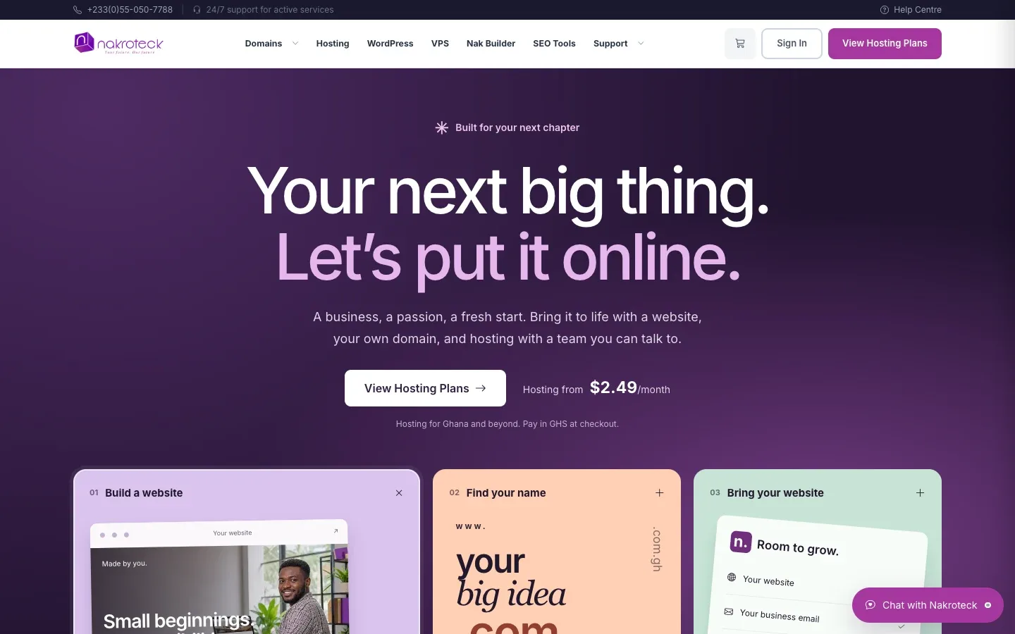
A common question from businesses that sell more than one thing: how do we put everything on the website without burying the buyer? A single product is easy to explain. Five or six, each with its own plans and prices, can turn a home page into a wall of options, and that wall is even taller on a phone.
Nakroteck, Ghana's home-grown hosting brand, had exactly this problem. It sells web hosting, domain names, WordPress hosting, VPS servers and a no-code website builder to businesses across Ghana. We designed and built its public website from the ground up, from brand direction and page structure through to a responsive front end.
The brief had three parts: explain a wide product range clearly, put local pricing and local support front and centre, and send visitors into checkout without friction. Here is how the site does that, and what you can borrow for your own.
Start with what the visitor wants to do, not what you sell
Six product lines, each with its own plans and pricing, had to fit into one site without overwhelming a first-time buyer. The answer was not to show all six at once.
The site is built around one idea: get your business online today, with a team you can actually talk to. A single hero leads into three clear paths: build a website, find a domain, or bring an existing site. A visitor does not need to know the difference between shared hosting and a VPS to pick one of those. They only need to know what they are trying to do.
What to take from this: group your products by the jobs your customers come to do, and make those jobs the first choice on the page. The product names can come one click later.
Give each product its own focused page
Behind those paths, hosting, domains, WordPress, VPS and the builder each get a focused page with its own plan comparison. Someone comparing hosting tiers is not distracted by VPS specifications, and someone looking for a domain lands on a page built around a live domain search.
That search covers eight Ghanaian and international extensions, so a business can check a .com.gh and a .com in the same place.
What to take from this: one product, one page, one comparison. If a page is trying to sell two different things, it is usually two pages.
Answer the doubts before the price
The questions a first-time buyer asks most often (is there local support, can I pay in cedis, will you migrate my site) needed answers before the pricing table, not after it. A price means little to someone who is not yet sure they can pay in their own currency or reach a person when something goes wrong.
So the site answers them early and repeatedly. The local phone number and 24/7 support promise sit in the top bar. WhatsApp and phone support entry points appear on every page. And "bring an existing site" is one of the three paths from the hero, so a business that already has a website sees straight away that moving is an option.
What to take from this: list the two or three doubts that stop people buying from you, and answer each one before the visitor reaches a price. Repeating the answer on every page is not clutter if it is the thing they are worried about.
Make the currency question disappear
Prices on the site are shown in dollars, with payment in cedis at checkout, and every plan carries a pay-in-cedis note. A buyer never has to go looking for the answer or wonder whether a foreign card is needed.
This is a small line of text with a large job. Wherever price and payment currency can differ, the gap between them is a reason to hesitate, so the site closes it right next to the price.
What to take from this: put payment details (currency, methods, local options) beside the price itself, not in an FAQ at the bottom of the site.
Design the comparison for a narrow screen first
Most Ghanaian traffic arrives on a phone over mobile data, so every page and every plan comparison had to work on a narrow screen first. On the Nakroteck site, plan comparison cards reflow to a single column on phones, so four hosting tiers can be compared on a phone.
Speed is part of the same decision. The front end is server-rendered, with a small amount of JavaScript kept for the jobs that need it: the domain search, the mobile navigation and chat. That keeps pages light for visitors on mobile data.
What to take from this: before approving a pricing page, open it on an ordinary phone. If a buyer cannot compare your plans comfortably with one thumb, the layout is not finished.
Offer a first step that is not a purchase
Not every visitor is ready to buy hosting today. The site offers a free website health check, which gives visitors a reason to engage before they buy. A help centre and blog support people who would rather find answers themselves, and cookie consent is privacy-first, with an essential-only option.
What to take from this: give undecided visitors something useful to do, such as a check, a guide or a quick question, so the next step is not "buy now or leave".
A checklist for a multi-product site
If you sell several products or plans, these are the questions we would work through before any design starts:
| Question | Why it matters |
|---|---|
| What are the three or four jobs customers come to do? | They become the first choice on the home page. |
| Which product answers each job? | Each one gets its own focused page. |
| What stops people buying? | Those answers go before the price. |
| How will customers pay, and in what currency? | That note sits beside every price. |
| Does every comparison work on a phone? | Many visitors will only ever see the phone layout. |
| What can an undecided visitor do? | A free first step keeps them talking to you. |
We agree the pages, content and features in a fixed-price scope during discovery, and you can click through the site on a staging link while it is built.
Talk to us
If your website has to explain more than one product and you want it to stay clear on a phone, get in touch. Read the full Nakroteck website case study, or see how we approach website design and development.